Client

Nik Kacy EFW

Description

EFW Festival Website

Year

2024

Background

In this portfolio case study, I showcase the transformative redesign of Nik Kacy's Equality Fashion Week website, an organization advocating gender equality in LA through fashion shows and other events. I focused on modernizing the website's visual aesthetics and streamlining its service categories to meet the evolving needs of the events. The initial design was depreciated, lacking the contemporary flair and intuitive user experience today's digital landscape demands while having an accessible CMS system. 


The client was in a rush and was hesitant to sign a contract or start in a structured manner, adding to the excitement of the project. 

Objectives

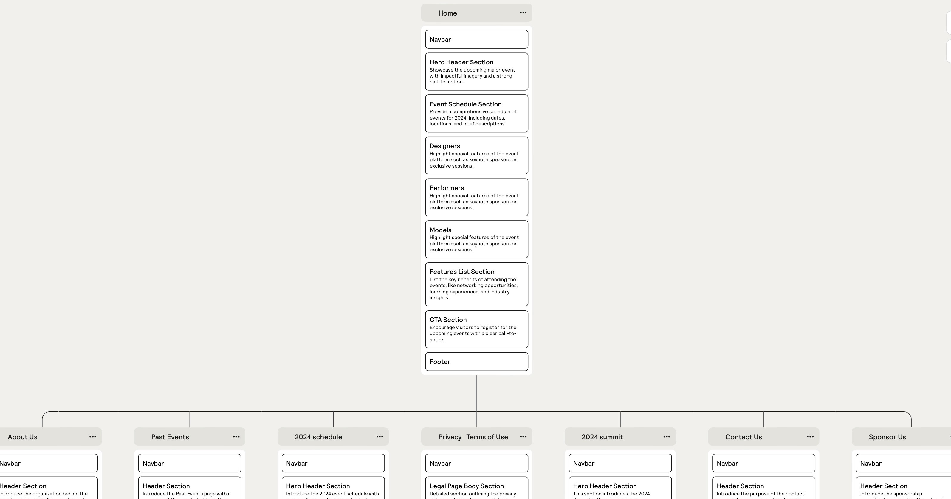
We wanted to help the website appeal to a larger audience and ensure it resonated with current and prospective users while maintaining brand consistency. The client wanted to showcase past event production projects and services with an easy-to-use UI. The client wanted a "sexy" design, so we opted for a simple design with interactive hover and user-friendly scroll animations. Above, you can see what the site map would have looked like if we managed to get that done. Sometimes projects are like that… Just got to get it done… 


The sitemap shown above is a crucial element in laying out the structure of the site and placing content sections in the overall design. It's a tool that allows for brainstorming and alignment with stakeholders.

The Process

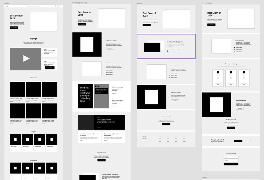
The wireframe above illustrates how a responsive and dynamic website can be structured and how all the assets, components and pages can be connected, giving a bird's eye perspective with as little or as much detail as required for its purpose. 


Creating a journey map and user flow can flesh out the overview and detailed view of tasks by analyzing various perspectives of the user experience journey a user routes through. After taking those insights, the designers can create better designs that are easy and enjoyable to use, accessible and resolve the problem, giving value to the customer and, indirectly, the organization. 


These tools enable the team to understand the user experience, make informed decisions, and enhance the design, resulting in a superior product bringing value to the company. 


They also facilitate a deeper understanding of the website's overall structure and vision, allowing the client to approve each documented step. These techniques enable us to achieve what would otherwise be highly challenging by simplifying complex processes. They help ensure alignment and facilitate communication before investing time and effort into designs, limiting the required revisions and saving resources.


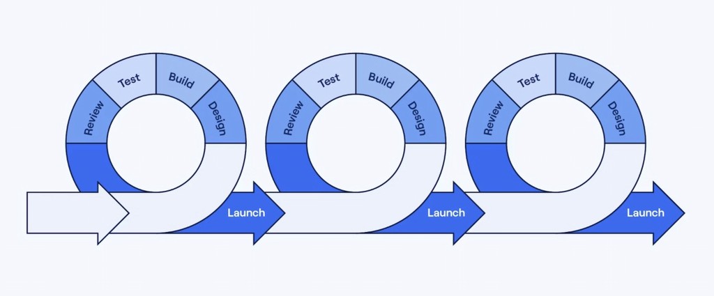
My approach to this project was iterative and Agile.

Backing Up and File Handling

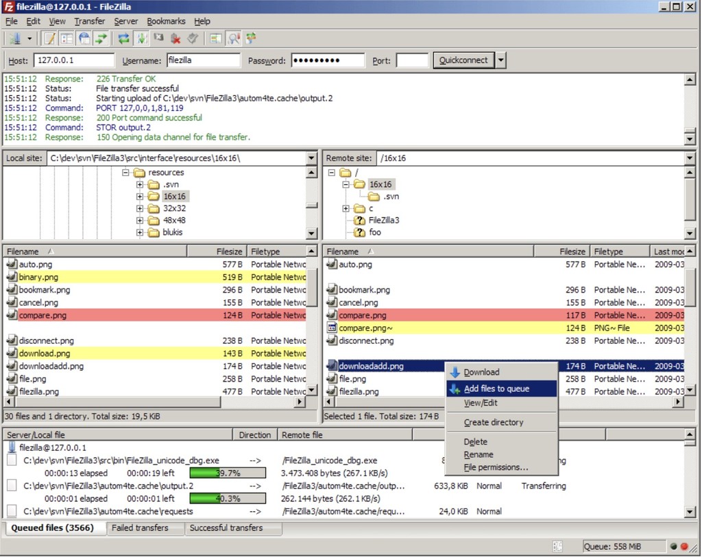
While working on this project, I stressed the importance of backing and organizing our files as we progressed. When working with design software like Adobe CC and Framer, it's crucial to prioritize file management and backup protocols. Design files can be complex and contain numerous layers, assets, and iterations, making them vulnerable to data loss or corruption. I conducted regular backups, ensuring our hard work was safeguarded against unexpected software crashes, computer failures, and human error. A well-organized file structure and naming convention also help streamline collaboration, version control, and asset retrieval. By implementing a robust backup strategy and maintaining a tidy digital workspace, designers can minimize downtime, reduce stress, and focus on creating exceptional designs.


As a point of interest, I took the lead in establishing a file management SOP and spearheaded the migration of our local server files to M365 at Linkup. I meticulously organized all our files and work into various SharePoints. These Sharepoints were accessible and linked to different teams in the Teams apps and through our company, Onedrive. Our teams highly valued this initiative. 

Ins and Outs

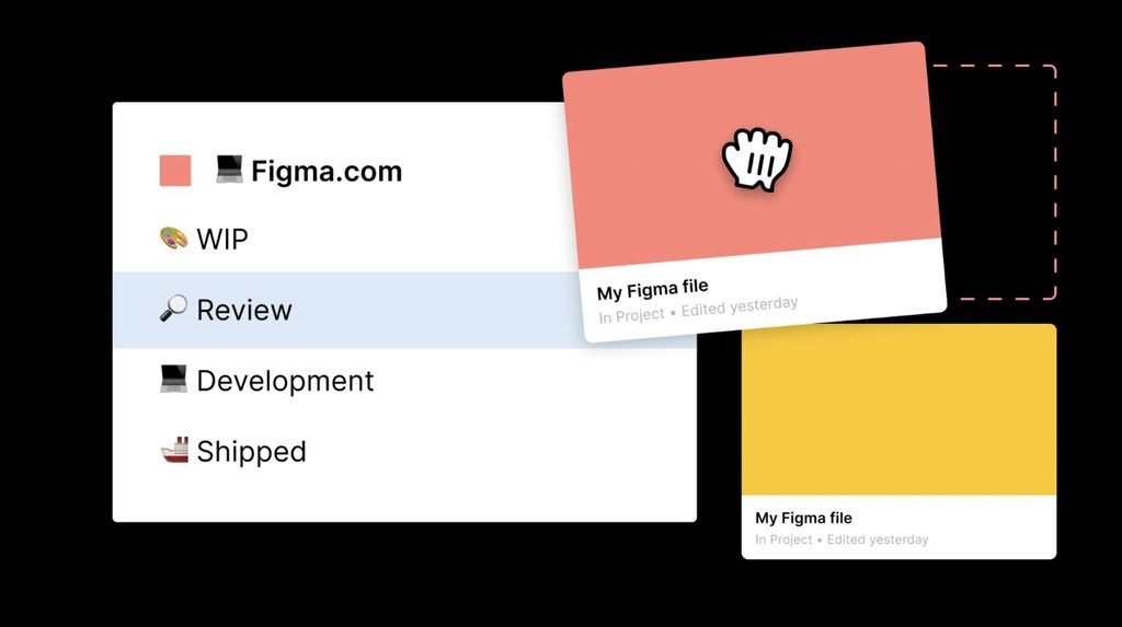
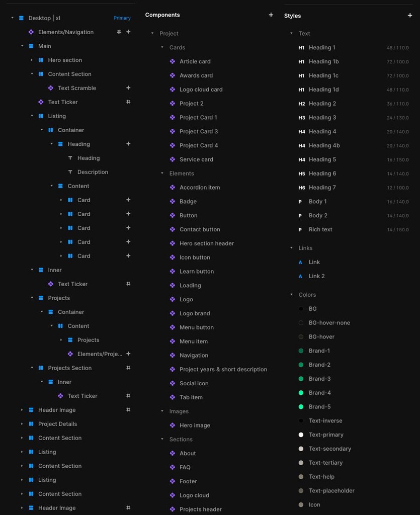
Through my extensive experience with Framer and Figma, I've developed a keen eye for identifying poorly built designs, recognizing when best practices haven't been adhered to and navigating tools efficiently. 


Some questions arise: 


  • How has the site's structure been compiled? 

  • How are the components laid out and connected to other parts of the site?

  • What naming conventions and variables are used? 

  • Have layers and tags been utilized correctly?


A systematic approach, which is crucial, will streamline a person's workflow and be highly appreciated by anyone else who comes to work on the site. Utilizing layers well helps with efficiency.


Moreover, it's vital to extend our focus beyond the site's design. The sitemap needs to be submitted and set up for efficient browser crawling. SEO and marketing strategies should also be carefully considered. You can find some of my notes on marketing here

Accessibility

Designs must be accessible to be usable. They must be accessible to bots and humans alike. Various tools, such as semantic tags, frame tags, image ALT text, contrast ratio, and so on, help organize the web structure to improve accessibility for both. 

Designs must be accessible to be usable. They must be accessible to bots and humans alike. Various tools, such as semantic tags, frame tags, image ALT text, contrast ratio, and so on, help organize the web structure to improve accessibility for both. 

Designs must be accessible to be usable. They must be accessible to bots and humans alike. Various tools, such as semantic tags, frame tags, image ALT text, contrast ratio, and so on, help organize the web structure to improve accessibility for both. 

Design Systems

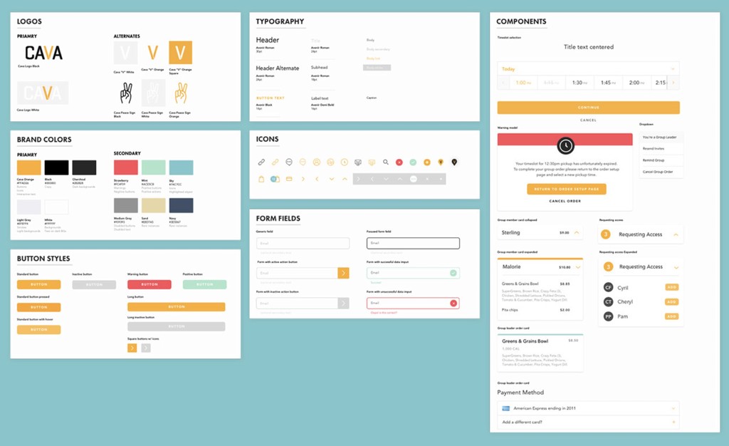
At the outset of a project, a designer must establish a design system that aligns with the brand identity and reflects the company's vision and mission. Creating a design system can involve the following: 


  • defining a tone of voice that resonates with the brand language, 

  • selecting a colour scheme that embodies the company's values and

  • choosing a font and typeface that echoes the brand's personality 


By doing so, the design system becomes not just a tool, but an integral part of the company's overall strategy, reinforcing its purpose and goals.


A well-crafted design system, such as the ones used by Atlassian or Google, not only ensures consistency across the website, fostering trust and credibility with users, but also revolutionizes the design process, making it more efficient and faster. In web design, the complexity of the site's structure and interconnected elements presents additional challenges. Best practices dictate the use of components that can be easily integrated into the website at various points. These components can be edited centrally, ensuring consistency across the website and making updates more efficient.


By aligning the design system with the company's vision and mission, designers can confidently create a cohesive and purpose-driven user experience that not only supports but also propels the organization's objectives. 


With experience, designers can harness the benefits of these systems, think systematically, and work efficiently, crafting websites that look visually appealing and contribute to the company's success.

Schedule

2024 Event Schedule

2024 Event Schedule

Secure your spot before tickets sell out!

Secure your spot before tickets sell out!

Coming Together

The client and I explored various designs they liked, and I got to work implementing the site's structure, tailoring the necessary components, and incorporating the provided content. I utilized Adobe CC, Framer, and Figma and assisted with porting over the domain and setting up initial analytics. With my background in website development, content management systems (CMS), HTML, CSS, and UX design, I created a user-centric, visually appealing, interactive, and responsive website that met my client's needs and exceeded their expectations. The website now provides an intuitive user experience, easy navigation, and a clear presentation of the client's services, significantly boosting engagement and conversion rates. This has led to a positive impact on the client's business goals, instilling optimism and confidence in the project's outcomes. A sample of the design in an early stage is shown above.


The client and I explored various designs they liked, and I got to work implementing the site's structure, tailoring the necessary components, and incorporating the provided content. I utilized Adobe CC, Framer, and Figma and assisted with porting over the domain and setting up initial analytics. With my background in website development, content management systems (CMS), HTML, CSS, and UX design, I created a user-centric, visually appealing, interactive, and responsive website that met my client's needs and exceeded their expectations. The website now provides an intuitive user experience, easy navigation, and a clear presentation of the client's services, significantly boosting engagement and conversion rates. This has led to a positive impact on the client's business goals, instilling optimism and confidence in the project's outcomes. A sample of the design in an early stage is shown above.


The client and I explored various designs they liked, and I got to work implementing the site's structure, tailoring the necessary components, and incorporating the provided content. I utilized Adobe CC, Framer, and Figma and assisted with porting over the domain and setting up initial analytics. With my background in website development, content management systems (CMS), HTML, CSS, and UX design, I created a user-centric, visually appealing, interactive, and responsive website that met my client's needs and exceeded their expectations. The website now provides an intuitive user experience, easy navigation, and a clear presentation of the client's services, significantly boosting engagement and conversion rates. This has led to a positive impact on the client's business goals, instilling optimism and confidence in the project's outcomes. A sample of the design in an early stage is shown above.


The Results

The website was paired with a ticket gateway that allowed customers to purchase individual days so they could attend individual events during the overarching festival. We employed a soft launch approach to testing and asked friends to test the product. We then employed an iterative rapid prototyping approach to test the website and ensure all features worked on all devices and screen sizes, as desired.


The reception was very positive, and the organizers saw an uptick in ticket sales over previous years. 


The contract for this assignment did not include maintenance. After I handed them the project, the client wanted to make their own edits. Therefore, any errors seen in the current state are not due to my skills or abilities. 

Client

Linkup

Description

Computer Gaming Product Design

Category

Product/UX design

Year

Past-Present

Background

I was fortunate to attend a high school with a comprehensive art program, where I acquired drafting, graphic design, and SLR photography skills, including film development and printing, among others. This solid foundation in visual arts and technical skills served me well in my subsequent studies.


At OCADU, I pursued a degree in Sculpture/Installation, honing my fabrication techniques, including furniture making and carpentry. Through critiques and interactive projects, I developed a keen eye for spatial awareness, user-centric design, and effective communication.


These skills enabled me to transition into product design, where I had the opportunity to work on various projects. I became proficient in using Shapr3d, Solidworks, and 2D drafting CAD software, allowing me to bring my designs to life.


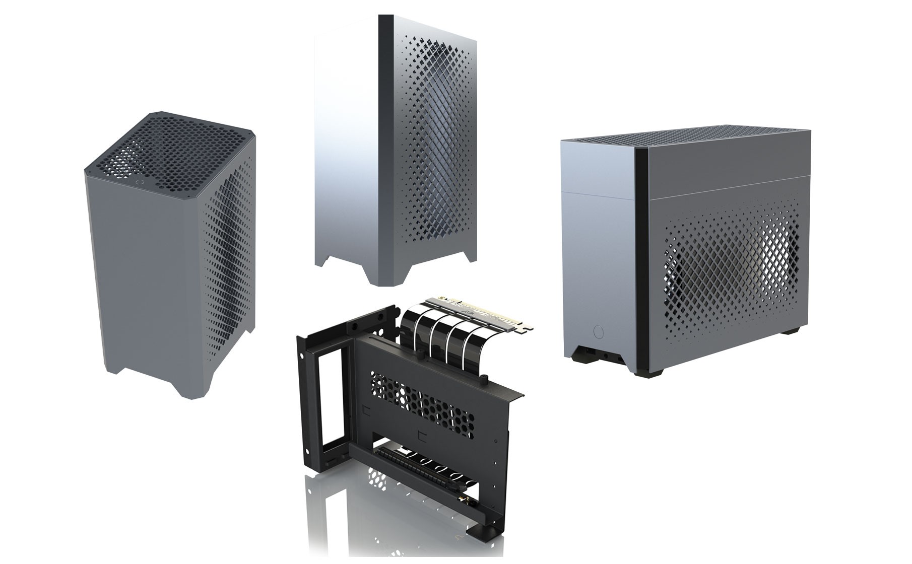
In response to the gaming community's demand for innovative, compact, and high-performance GPU displays, Linkup seized the opportunity to cater to this niche market. The challenge was to design gaming hardware that was both functional and visually stunning, a project that aligned perfectly with my skills and product design interests.

Objectives

The aim was to design two mini ITX computer gaming cases (one tower and one designed with an optional top-hat to store a water cooling system), and a versatile vertical GPU bracket that would allow gamers to showcase their GPUs in a prominent and stylish manner. The designs needed to be compact, functional, and align with the aesthetic preferences of the gaming community. The designs presented many technical challenges and required all parts to be clearly specified.

The Process

The project began with market and user research to understand gamers' preferences and needs regarding hardware aesthetics and functionality. This research informed our analysis of various mini ITX cases, and we identified key features to incorporate into our product.


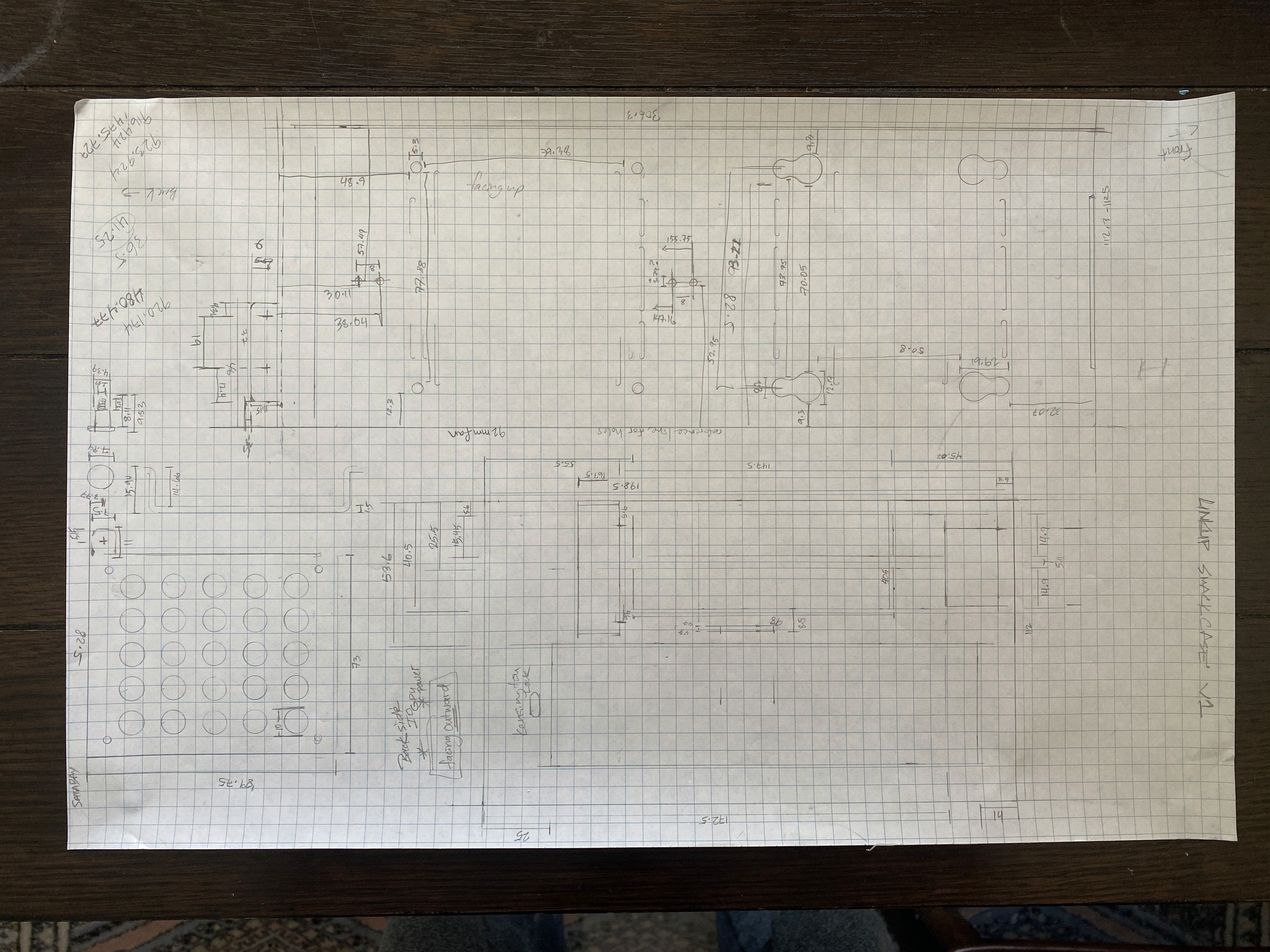
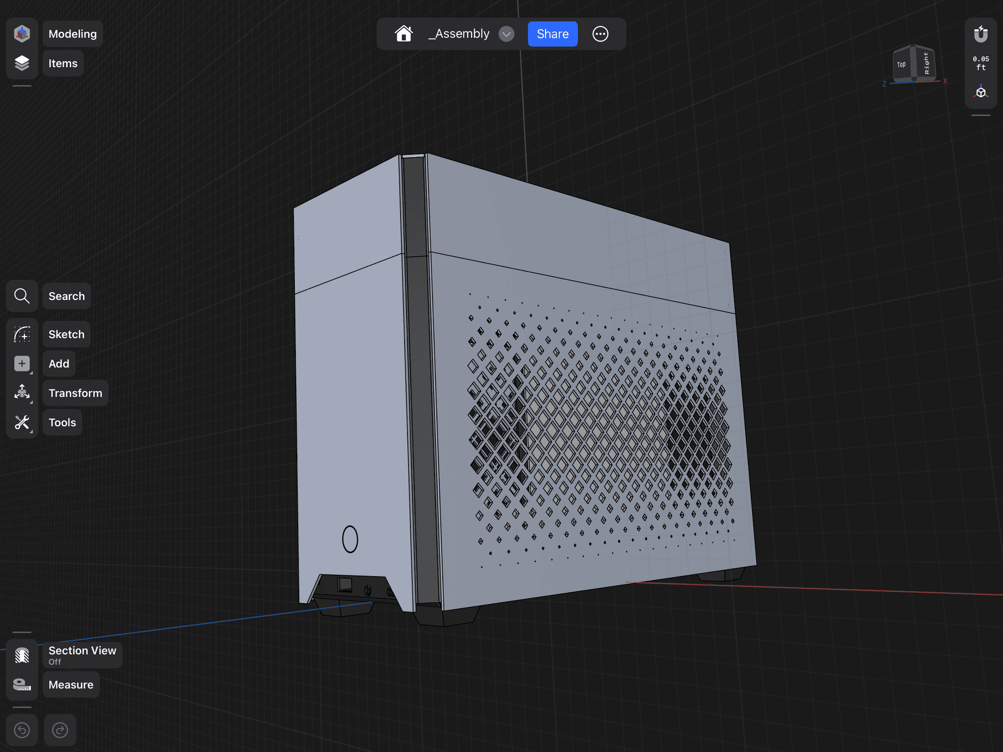
Next, I reverse-engineered several cases and created initial hand-drawn sketches, which were later refined into 2D CAD drawings. These drawings were shared with our engineer, who developed a 3D model in Solidworks. We utilized simulations to ensure accurate component fitting within the case, streamlining the design process and reducing prototyping time and costs.


Through collaboration with our engineer, we ensured that the designs were both visually appealing and technically sound, meeting compatibility and functionality requirements. User testing with gamers provided invaluable feedback, which we incorporated into rapid prototyping simulations, leading to design refinements that fully met user expectations.


Finally, I worked closely with manufacturing partners to develop the product and secure sample approvals, as seen in the technical drawing below.

The Results

The culmination of our efforts resulted in a marked increase in customer engagement and satisfaction for Linkup, as evidenced by positive feedback and improved metrics post-launch. Our designs not only elevated the brand's visual identity but also played a pivotal role in enhancing product understanding and appeal, leading to a notable uplift in sales and market position. These projects stands as testaments to the power of thoughtful design and strategic collaboration in driving meaningful business outcomes. Below, you can see an image of the technical drawing of a vertical GPU bracket part that the factory sent back to us for approval before production.

Client

Theoretical

Category

App Design

Year

2024

Background

User experience design, a concept integral to our daily interactions, is not just a buzzword but a reality that shapes the world around us. From the mugs we use to the complex systems we navigate, designers have continually refined and improved their creations based on user feedback and careful consideration. As a human-centred society, we've developed a wide range of designs over the years, with the best ones emerging from a deep understanding of what works, what's accessible, and what's easy to use. This means that every time you use a well-designed product, you're experiencing the impact of user-centered design in your daily life.


This understanding is achieved through user research and rapid prototyping, allowing us to iterate and refine our designs quickly. But this process is not complete without valuable user input. While some designs may have evolved over generations, the modern world demands a faster pace. We must move rapidly to develop a product effectively, recognizing that blind spots can limit our perspectives. By gathering diverse viewpoints and conducting thorough research, we can empathize with users, uncover valuable insights, and create more inclusive and user-friendly solutions. User participation in this process is crucial, as it ensures we always meet the latest user needs.


By adopting user-centered approaches, we can create not just good, but superior products that drive sales and deliver effective solutions. Imagine a world where all users can seamlessly navigate to the checkout or find solutions to the problems a project aims to address. This is the potential of user-centered design. By streamlining the user experience, we can increase conversions, enhance customer satisfaction, and ultimately, boost revenue. This practical value makes user-centred design not just a tool, but a powerful and beneficial approach for humanity. 


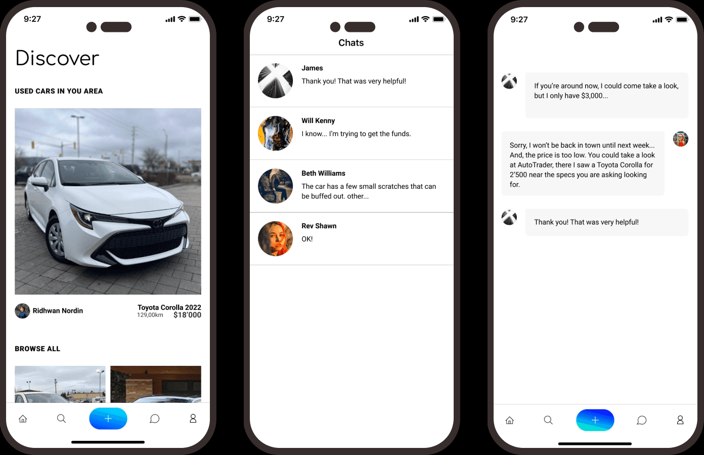
In the portfolio project below, I took on the complex challenge of streamlining the used car sales marketplace. This marketplace often presents users with cluttered interfaces, outdated web designs, and difficulties in filtering for specific features. Additionally, users face uncertainty regarding vehicle history and safety. Envisioning a solution that combines ease of use, accessibility, and customization; I created a user-centric used car app that addresses these pain points. This practice project aimed to provide a seamless and personalized experience for used car searches, empowering users to find their ideal vehicle confidently.

Objectives

Enhance User Experience: Design an intuitive and accessible app interface that simplifies finding used cars, focusing on user-friendly navigation and efficient search functionality.


Prioritize customization: Implement robust filters that allow users to search for cars based on safety ratings, features, and verified vehicle histories.


Personalize the Search: Develop a dynamic recommendation engine that tailors car suggestions to individual user preferences and past search behaviour.


Improve Aesthetics: Ensure that the app's design is visually appealing and aligns with modern design trends to enhance user engagement.

The Process

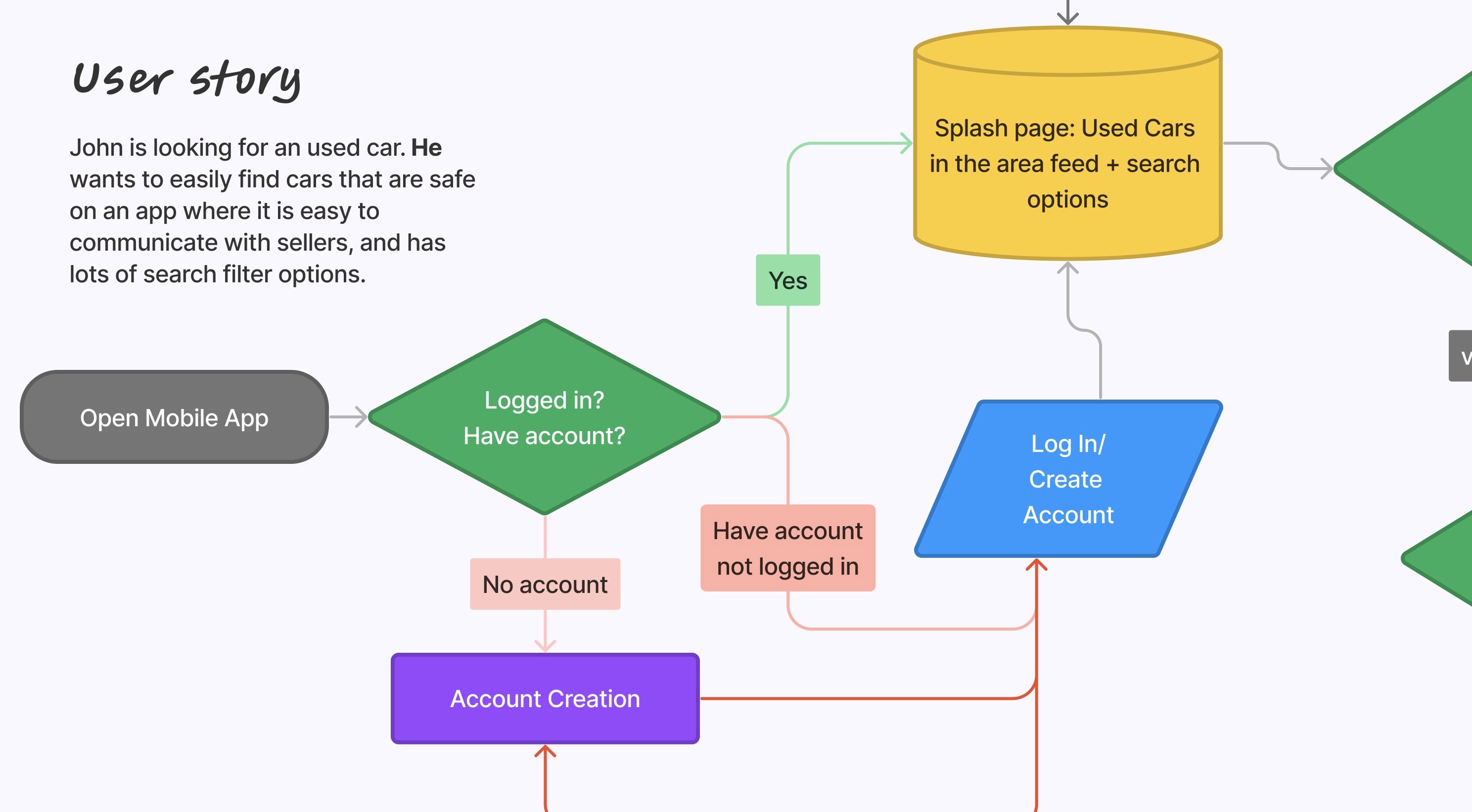
My journey began with researching user needs and pain points, analyzing competitors, and creating a persona that optimized the people experiencing challenges using veracious apps and websites to look for a used car. This person became "John."


Through empathetic user stories and a comprehensive user journey, I delved deeper into John's experience and identified key areas for improvement in the used car search and purchase process.


Next, I created some basic low-fidelity sketches to explore ideas quickly and avoid getting caught up in details early on. This allows for alignment with the larger team and stakeholders before wasting time on the details. 


After that, I created med-fi prototypes/wireframes and could start to nail down the user flow. User flows explain the decision tree in slightly more detail and may have more detailed content. 


Finally, I started moving into hi-fi mockups with much more detail, allowing for more detailed real-world testing. 


Finally, rapid prototyping allows for quick tests and user feedback, so I could change the buttons and other design elements according to what worked best. 


Incorporating app design best practices, I implemented advanced filters and planned for a recommendation system to personalize user experiences. 

The Results

The hypothetical launch of the used car app marked a significant milestone in transforming the way users hypothetically shop for used vehicles online. The focus on safety, a user-friendly interface, and personalized recommendations would have led to a notable increase in hypothetical user satisfaction and engagement. Users like John would have hypothetically enjoyed a seamless and reliable car shopping experience with the confidence that their chosen vehicles met stringent safety standards.


The hypothetical app would have received positive reviews for its clean design, intuitive navigation, and the peace of mind offered to used car buyers. By addressing the pain points of traditionally used car platforms, I created a differentiated product that would stand out in the market for its commitment to user safety and satisfaction.

Extras

Newsletter work

Coding

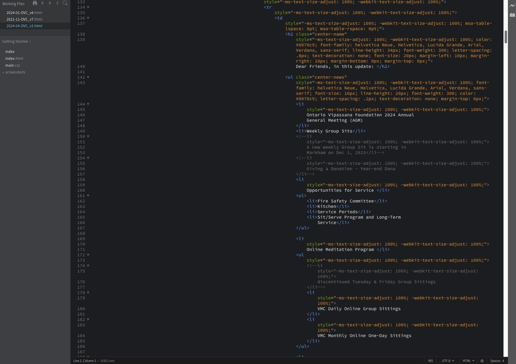
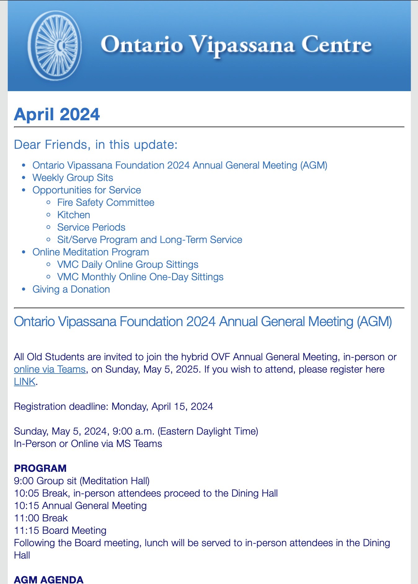
I have worked on the Ontario Vipassana Centre newsletters for about eight years, in addition to WordPress maintenance for their website. You can see below how we assemble the newsletters and what they look like when they are ready to be sent out. I have enough work knowledge and have figured it out on my own. I'm self-taught. It's not that complicated if you're patient. 

I have worked on the Ontario Vipassana Centre newsletters for about eight years, in addition to WordPress maintenance for their website. You can see below how we assemble the newsletters and what they look like when they are ready to be sent out. I have enough work knowledge and have figured it out on my own. I'm self-taught. It's not that complicated if you're patient. 

I have worked on the Ontario Vipassana Centre newsletters for about eight years, in addition to WordPress maintenance for their website. You can see below how we assemble the newsletters and what they look like when they are ready to be sent out. I have enough work knowledge and have figured it out on my own. I'm self-taught. It's not that complicated if you're patient. 

  • Graphic

    Design.

  • Graphic

    Design.

  • Graphic

    Design.

  • Graphic

    Design.

READY TO DO THIS

Let's get to work

Quick Links

woven.craters0f@icloud.com

© 2024. All rights reserved — Patrick East

READY TO DO THIS

Let's get to work

Quick Links

woven.craters0f@icloud.com

© 2024. All rights reserved — Patrick East

READY TO DO THIS

Let's get to work

Quick Links

woven.craters0f@icloud.com

© 2024. All rights reserved — Patrick East